Figma Travel App
Prototype of a collaborative travel planning app. Users pick destinations, split budgets, plan schedules, and vote on activities — focused on smooth group decision-making and high-legibility mobile UI.
Main features
- Trip planning: dates, destinations, shared itinerary.
- Group collaboration: notes and quick votes.
- Recommendations: places & activities.
- Smart suggestions: tailored to preferences.
- Sync: shared calendars & live updates.
Research overview
The process started with lightweight UX research to understand how groups plan trips, resolve disagreements, and keep schedules clear. Insights were translated into personas, journey scenarios, and user stories, then applied to navigation structure and mobile UI patterns.
- Persona: key user segments, goals, and constraints
- Empathy Map: emotions and pain points during gift selection
- User Scenarios: step-by-step journey from first search to saving ideas
- User Story: functional expectations aligned to real needs
- Low-friendlity wireframes: layout, navigation, and micro-interactions
- Palette & Tone: colors, typography, and component tokens
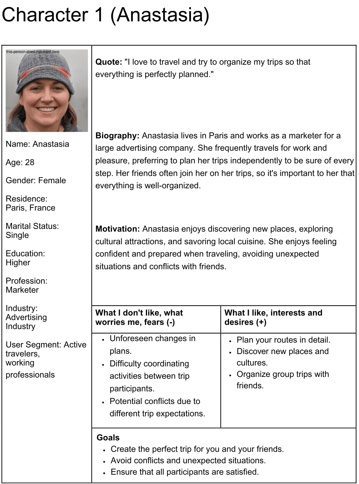
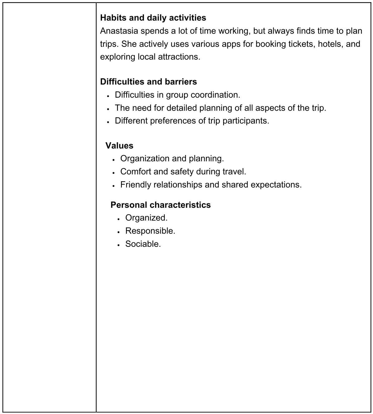
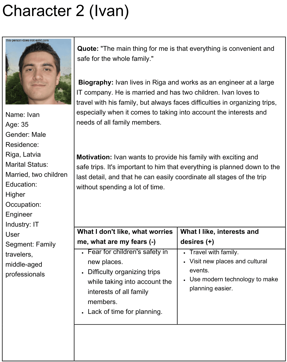
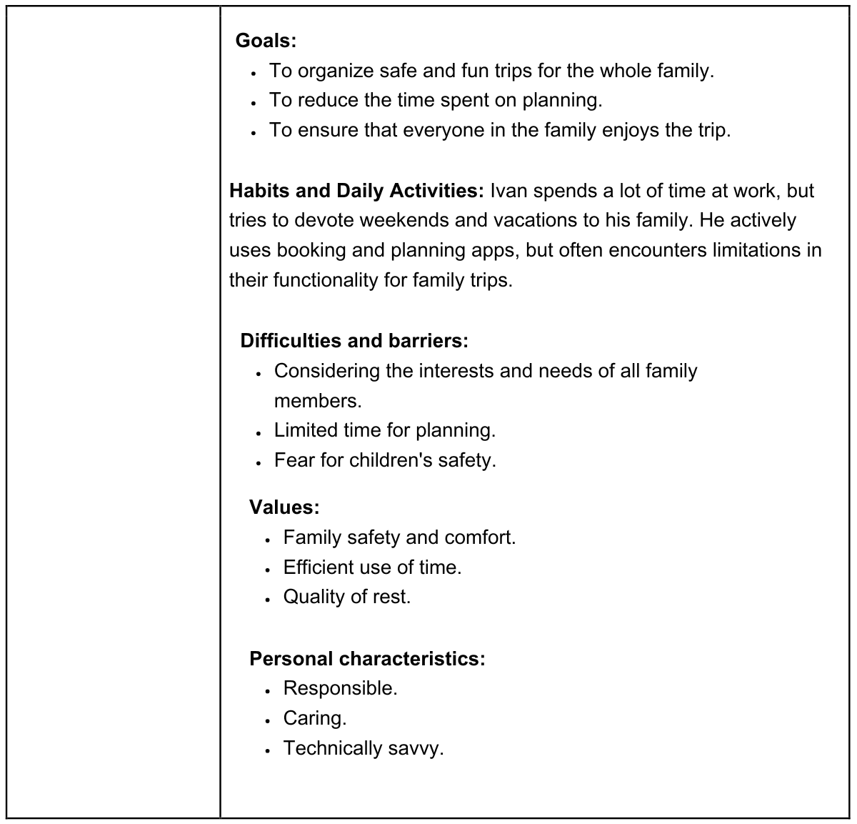
Persona
Personas helped define priorities: quick coordination, clarity of responsibilities, and reducing friction when planning with friends.
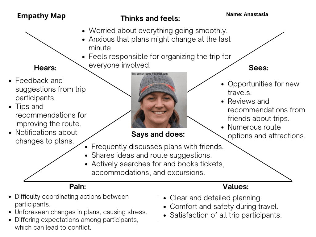
Empathy Map
Captures what users think, feel, and struggle with when planning trips together, helping shape microcopy and reduce coordination friction.
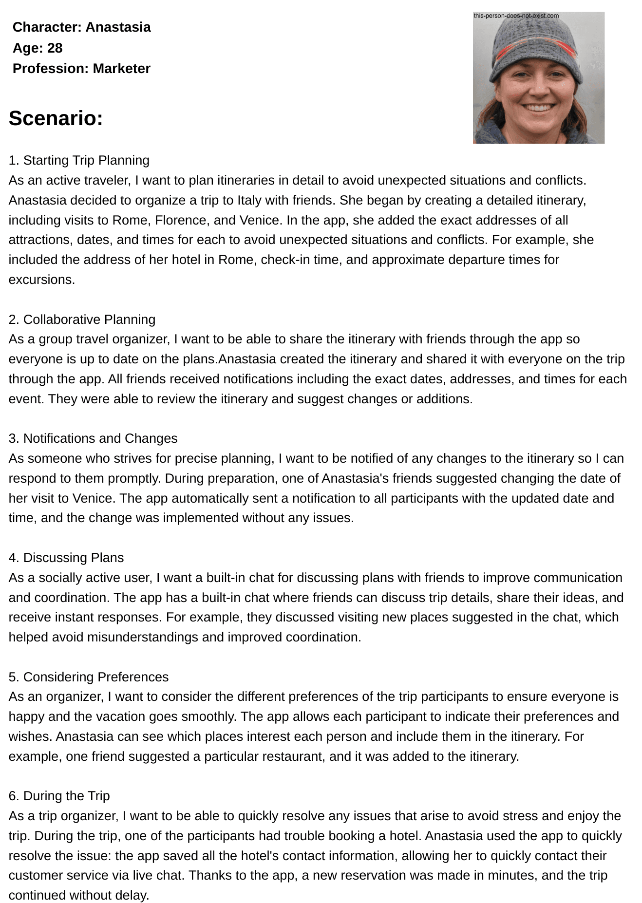
User Scenarios
Scenarios describe the flow from intent (“Let’s plan a trip”) to choosing destinations, agreeing on activities, splitting budget, and confirming the final shared plan.
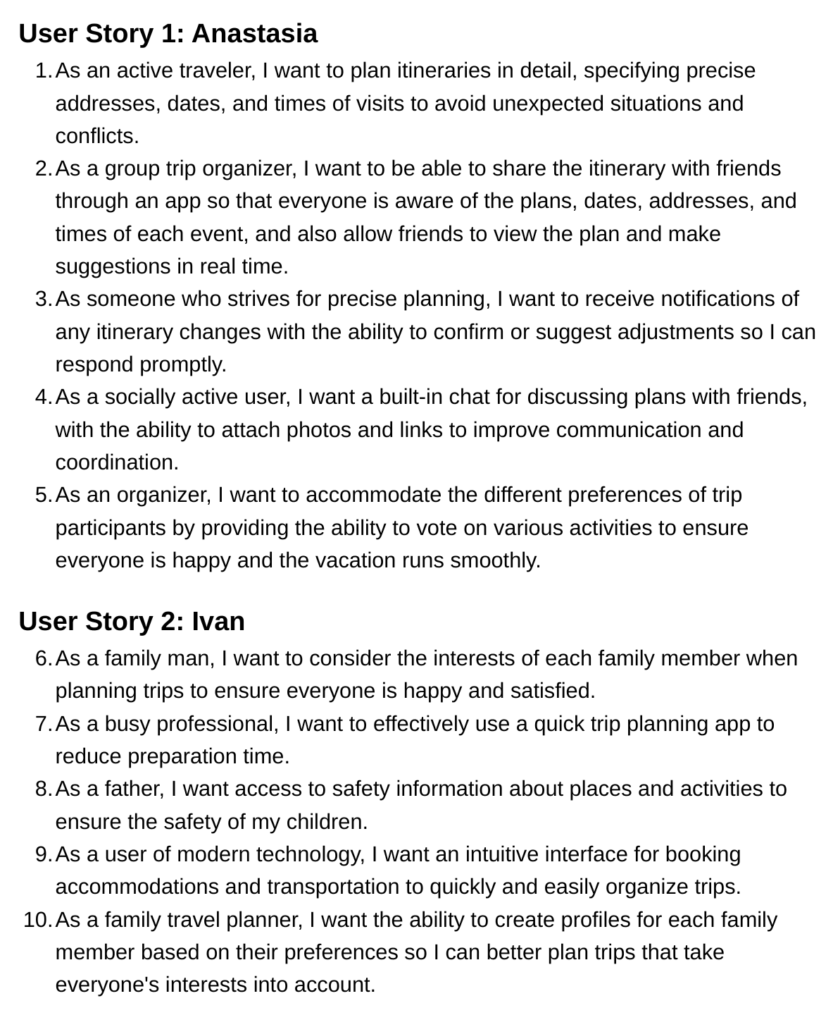
User Story
User stories helped validate the feature set and keep the prototype aligned with real expectations for group coordination and clarity.
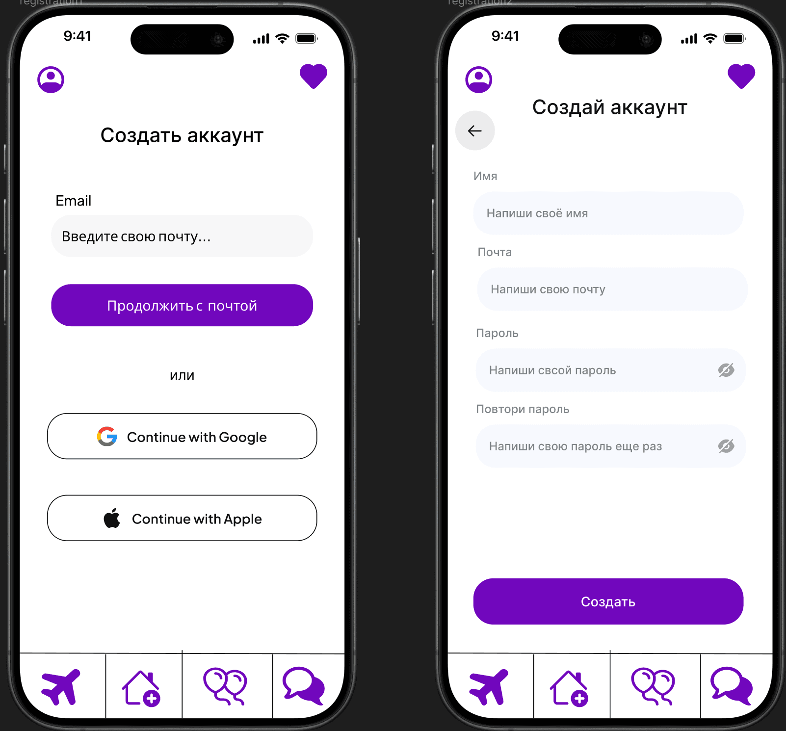
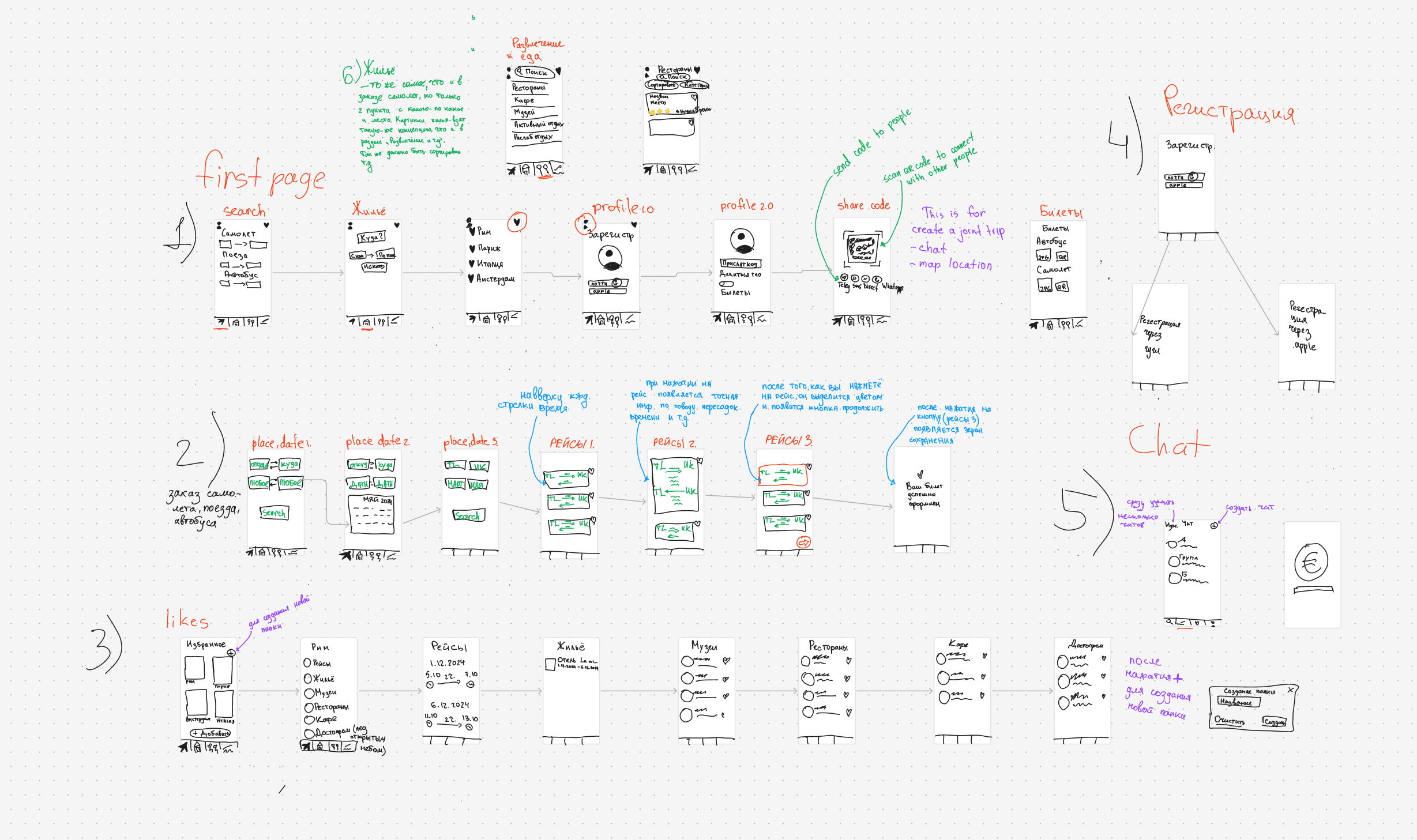
Low-fidelity wireframes
Early hand-drawn prototype created to explore layout structure, navigation flow, and screen hierarchy before moving to high-fidelity design in Figma. This stage helped validate core interactions and reduce unnecessary UI complexity.
Palette & Tone
The visual identity uses high contrast and bold purple accents to create a confident, modern, and energetic impression.
#000000#7107BD#FFFFFF#DAACFC#FEEDFF#D9B7F1Scheme
- Purple as the dominant accent color.
- High contrast with black for strong hierarchy.
- Soft pastel surfaces for visual balance.
Emotional intent
Young digital audience
- Energetic visual tone
- High contrast for clarity
- Modern minimal aesthetic
Brand confidence
- Strong purple as identity anchor
- Clear hierarchy
- Memorable visual presence
Usability focus
- Readable typography
- Clean spacing
- Balanced visual rhythm