Gift Helper — gift finder app
Mobile concept to quickly find the right present. Filter by age, budget, hobbies and occasion, save important dates, and store people’s preferences in a handy contacts list.
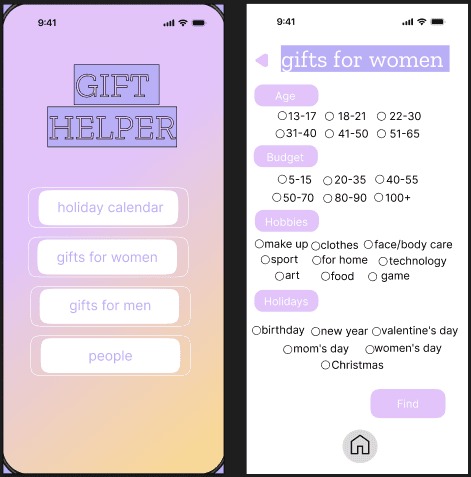
Core features
- Smart filters: age, budget, hobbies, event type.
- Lists for men/women: fast favorites.
- Calendar: reminders for upcoming dates.
- People profiles: preferences & suggestions.
- Micro-interactions: confirmations & toasts.
Research overview
The project started with lightweight UX research to understand how people choose gifts under time pressure and uncertainty. Based on insights, I created personas, empathy map, scenarios, and user stories, and then translated them into screen structure, navigation, and micro-interactions in the Figma prototype.
- Persona: key user segments, goals, and constraints
- Empathy Map: emotions and pain points during gift selection
- User Scenarios: step-by-step journey from first search to saving ideas
- User Story: functional expectations aligned to real needs
- Low-friendlity wireframes: layout, navigation, and micro-interactions
- Palette & Tone: colors, typography, and component tokens
Persona
Personas helped define priorities: fast decisions, budget control, and saving preferences for recurring occasions.


Empathy Map
Captures what users think, feel, and struggle with when choosing a gift, helping to shape messaging and reduce decision friction.

User Scenarios
Scenarios describe the flow from the first intent (“I need a gift”) to selecting filters, saving ideas, and setting reminders.

User Story
User stories helped validate the feature set and keep the prototype aligned with real expectations.

Low-fidelity wireframes
Early hand-drawn prototype created to explore layout structure, navigation flow, and screen hierarchy before moving to high-fidelity design in Figma. This stage helped validate core interactions and reduce unnecessary UI complexity.

Palette & Tone
The visual system feels supportive and optimistic to reduce decision friction and help users choose gifts faster.
#735BF2#EF5BF2#E8C3FF#BBAFFC#FFD88C#FFFFFF#000000Scheme
- Purple as the anchor for CTAs and key hierarchy.
- Pink adds emotional accents and playful micro-feedback.
- High contrast on light surfaces for fast scanning on mobile.
Emotional intent
User under time pressure
- Relief from overload
- Confidence to choose quickly
- Feeling guided, not judged
Planner (keeps dates / contacts)
- Sense of control
- Trust in saved preferences
- Calm about reminders
Gift giver (social occasions)
- Confidence in the choice
- Feeling thoughtful and prepared
- Positive emotional feedback