
VISUAL IDENTITY UPDATE · AFFINITY DESIGNER
Logo Redesign for Like
Refreshing a local phone accessories retailer’s identity to improve clarity, trust, and visibility in a competitive mall environment.
Project background
- Store type: local retail shop.
- What it sells: phone accessories and headsets.
- Location: a local shop inside a shopping mall.
- Competitive context: strong competition with Click, Evelatus, and OnOff.
Goal
Create a clearer and more recognisable brand mark that is readable at distance, scalable for print and digital use, and visually connected to the store’s category.
Visitors / Audience
Mall visitors who need accessories quickly, plus repeat customers looking for repairs, cases, chargers, and small tech essentials.
UX / Visual audit (old logo)
The original mark was too abstract and didn’t communicate the store’s category well. It also lost clarity at small sizes, reducing memorability and trust.
Why redesign
- Improve recognisability in a noisy retail environment.
- Increase perceived professionalism and trust.
- Make the logo readable and consistent across signage, packaging, and digital.
Concept
A friendly, modern mark that references communication/phone accessories through a simple and recognisable shape language, while staying scalable and clean.
Process
- Competitive scan + visual direction
- Logo sketches and iterations
- Testing at small sizes (print/digital)
- Mockups for real-world context
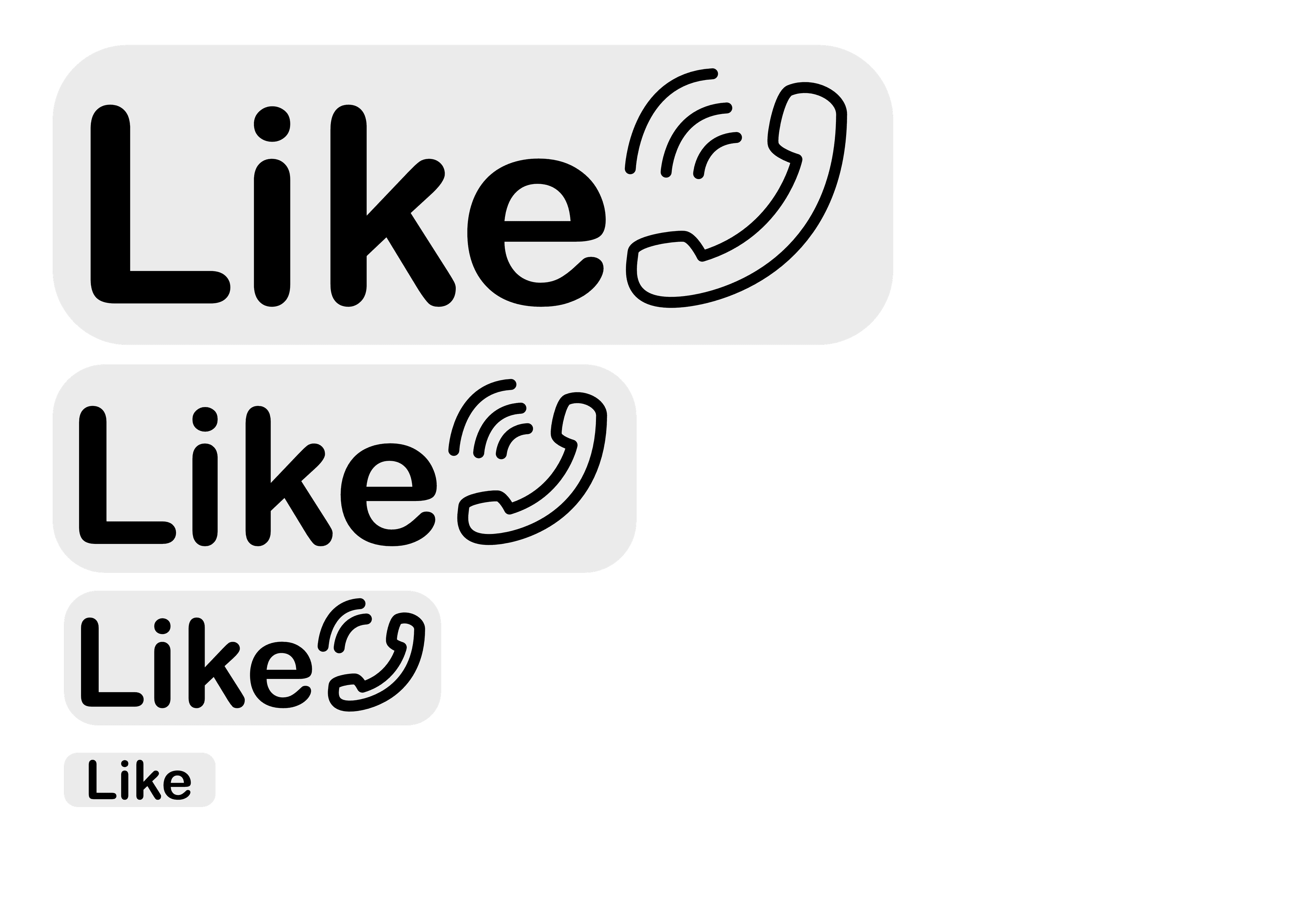
Final result
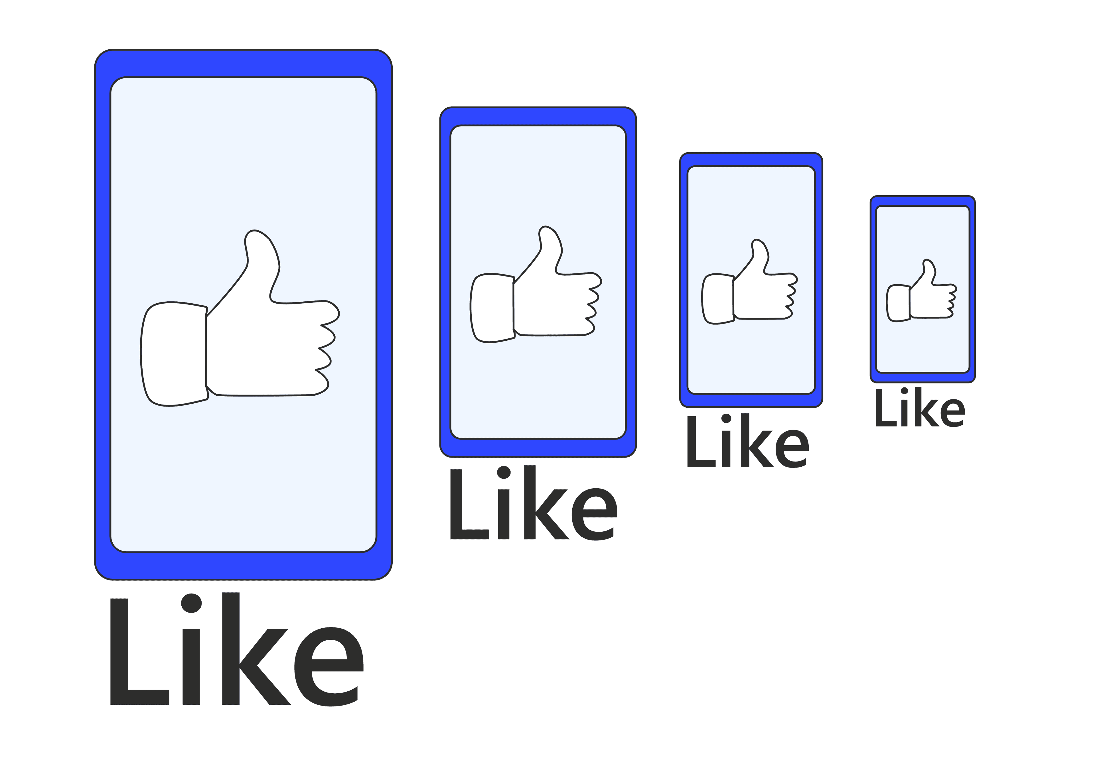
Before
Abstract mark with low association to the store’s products and weak scalability.
After
Clearer, more modern logo with recognisable cues and improved legibility for print and digital use.
Logo design
Mockups
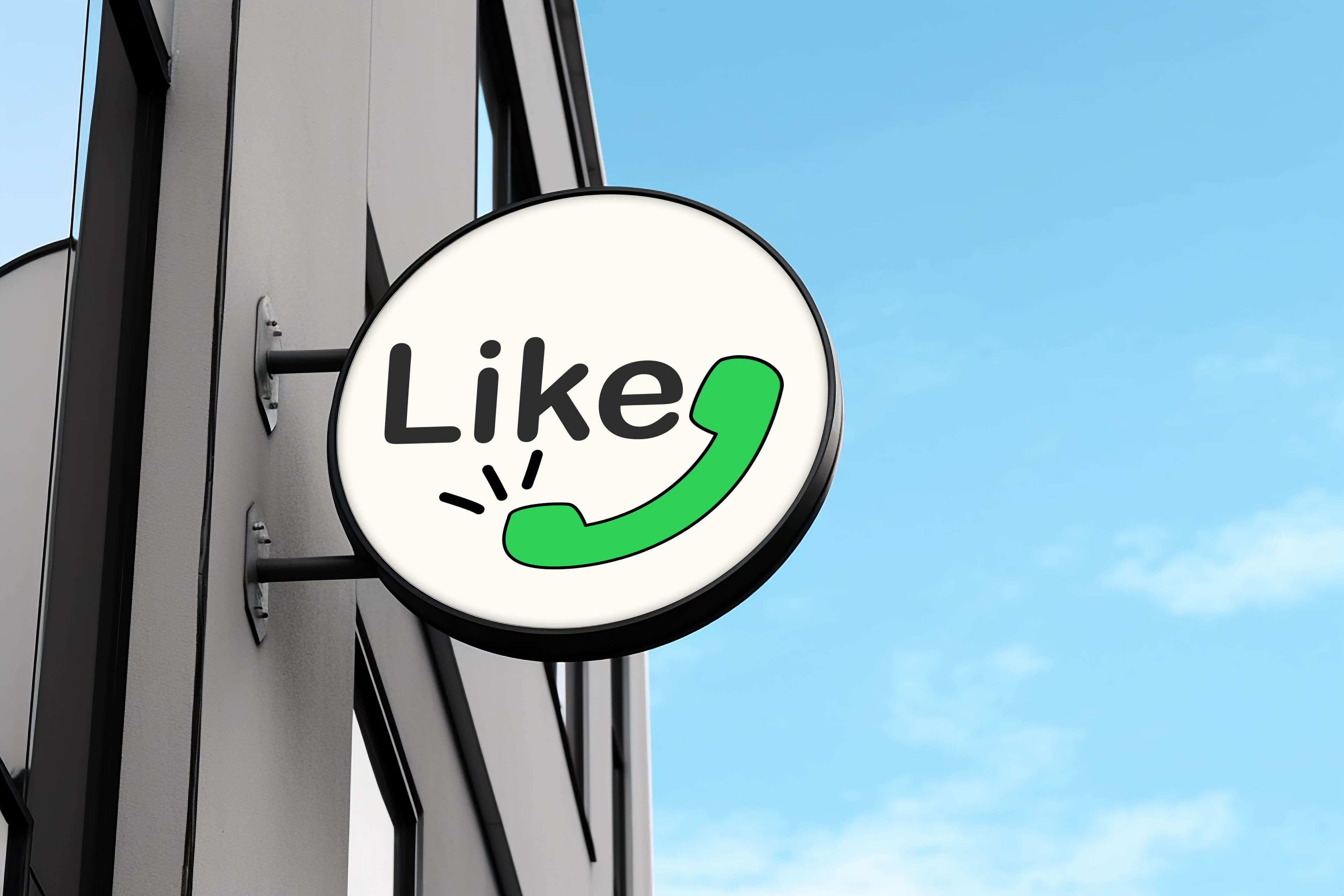
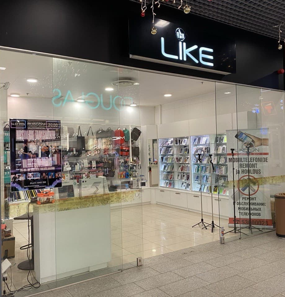
Store signage
Exterior storefront application demonstrating logo visibility, clarity at distance, and improved recognisability in a busy mall environment.
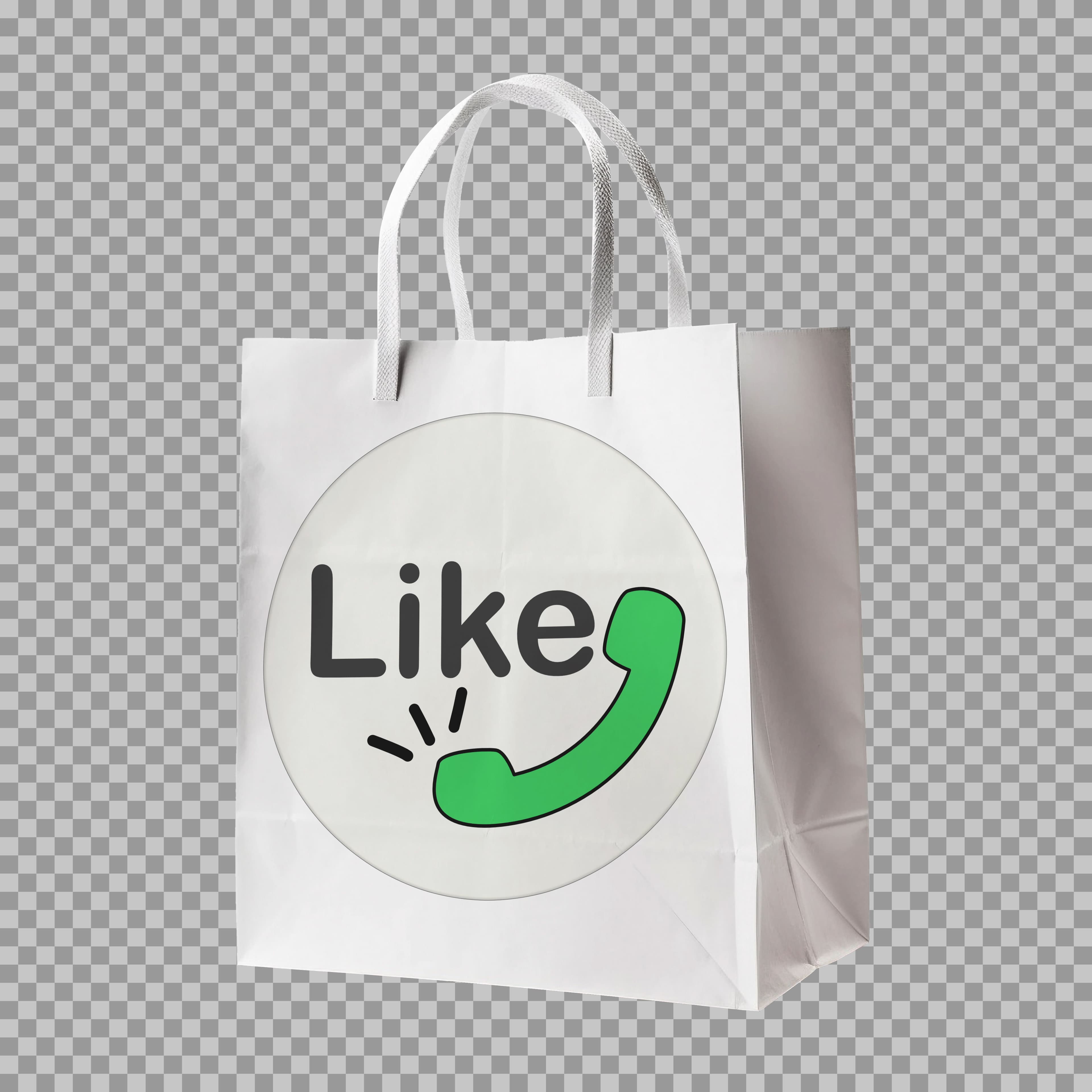
Packaging
Branded packaging design showcasing clean logo placement, scalable proportions, and consistent visual identity on retail bags.
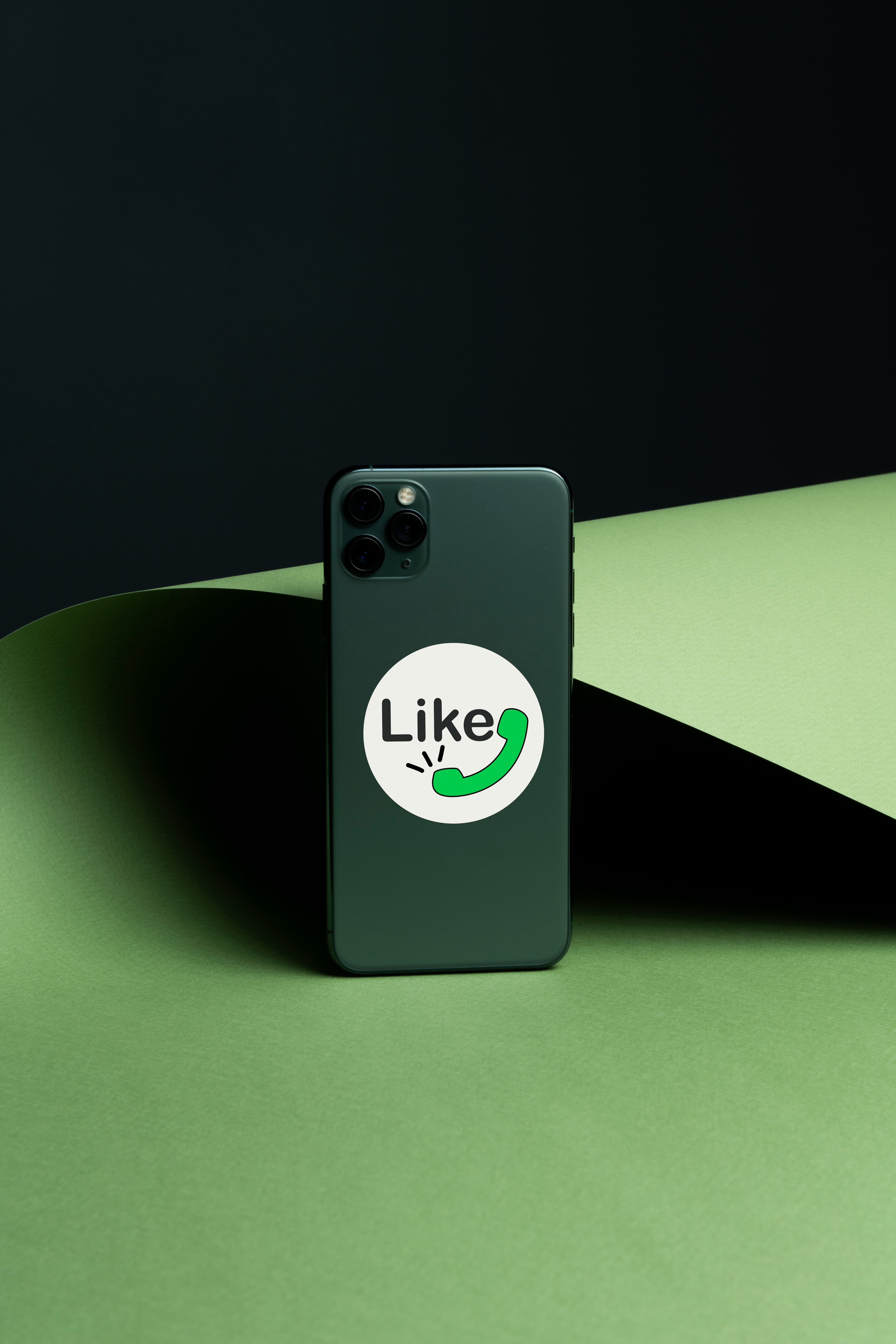
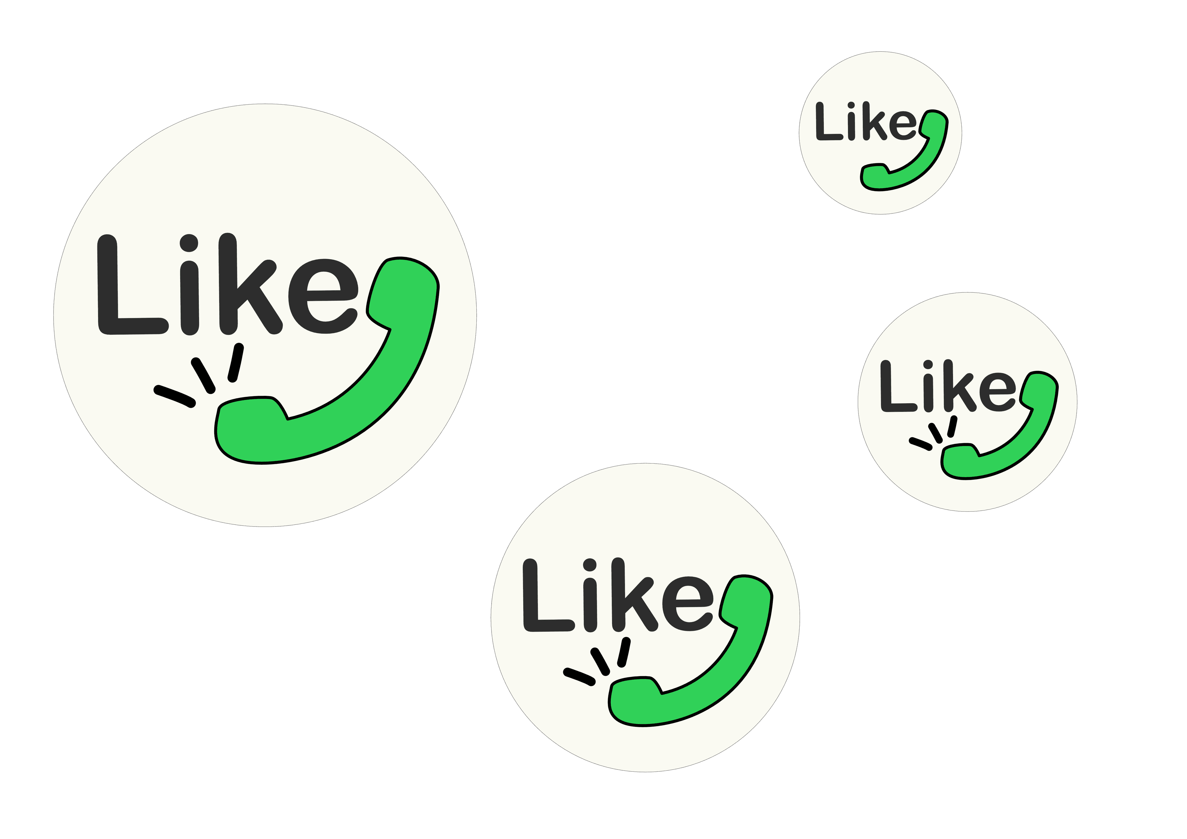
Brand visual application
Compact logo usage as a modern sticker-style element — suitable for business cards, promo materials, and social media visuals.
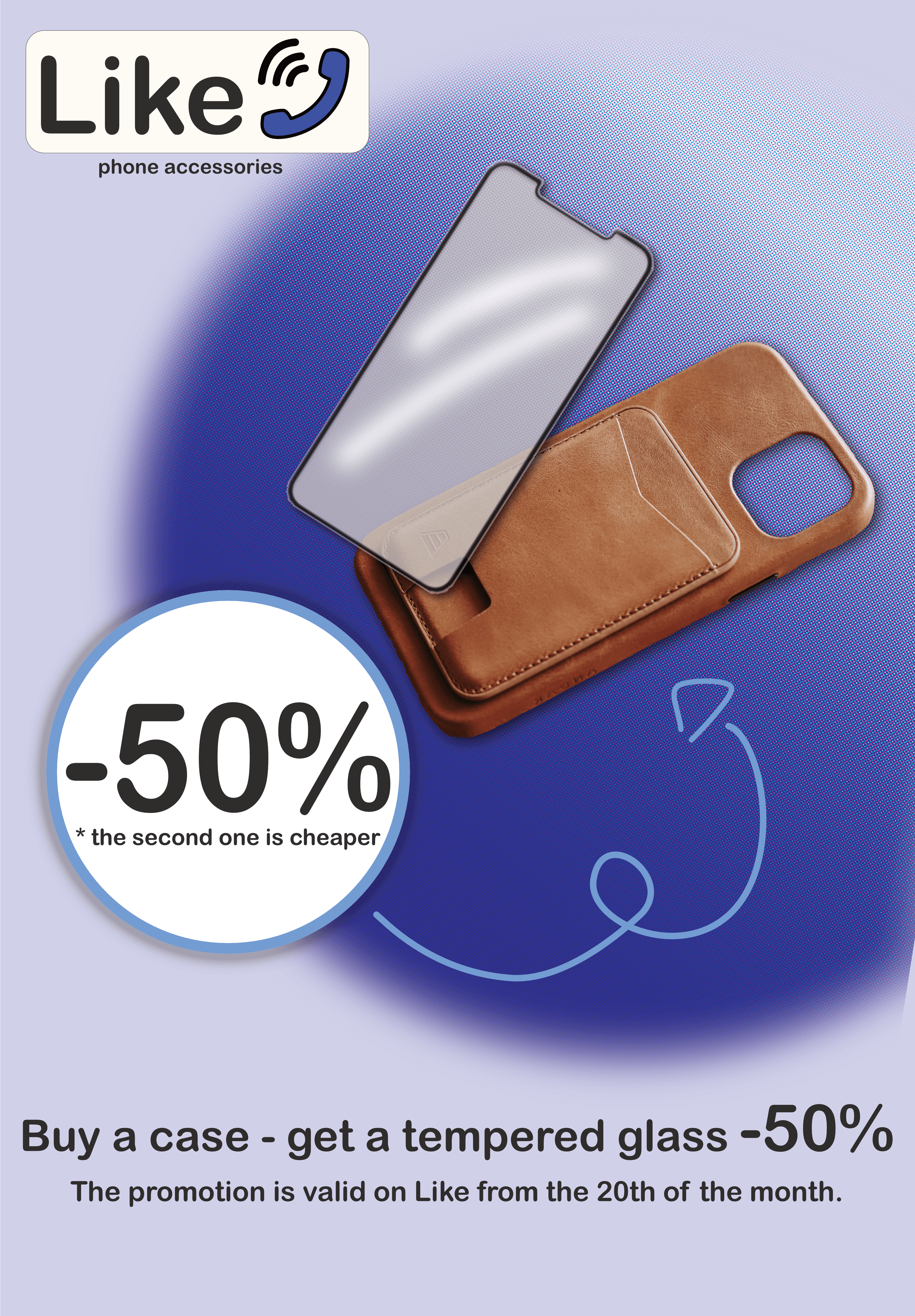
Promotional poster
In-store discount / campaign poster showing how the identity works with promotional messaging and remains clear in large-format print.
Outcome & learnings
- A more readable mark increased clarity and category association.
- Testing at small sizes helped keep the logo scalable and consistent.
- Mockups validated how the identity performs in real retail contexts.